Average of Best Fitness Per Generation#
This section provides a detailed view of how the best individual in each generation evolves across all experiments within a given round. The data is represented in a line chart that displays the mean best fitness per generation.
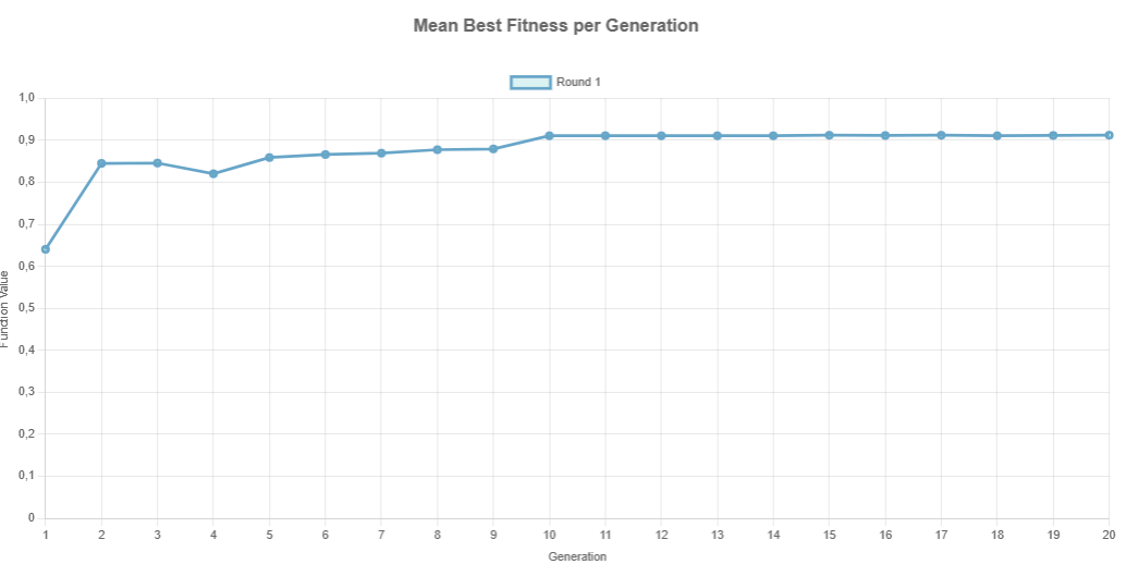
Each point in the curve represents the average fitness value of the best individual from each experiment for a given generation.
To illustrate how this is computed, consider the table shown below:
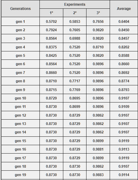
Take generation 1 as an example:
Experiment 1: Best fitness = 0.5702
Experiment 2: Best fitness = 0.5853
Experiment 3: Best fitness = 0.7656
Average = (0.5702 + 0.5853 + 0.7656) / 3 = 0.6404
This average value is plotted as the point corresponding to generation 1 on the chart.
The same process is repeated for all 20 generations, producing a smooth curve that allows the user to evaluate:
Convergence speed: How quickly the algorithm approaches optimal values.
Stability: Whether the curve stabilizes or oscillates.
Performance: General fitness trend across time.
Note: This visualization is fundamental to assess the efficiency of parameter settings and identify whether the genetic algorithm is behaving as expected.
Keep Graph and Navigating Between Rounds#
When the Keep Graph checkbox is selected, GADEMO stores the results of each new round without erasing the data from previous executions. This allows the user to accumulate multiple rounds and visualize their evolution in the same chart, which is essential for comparative performance analysis.
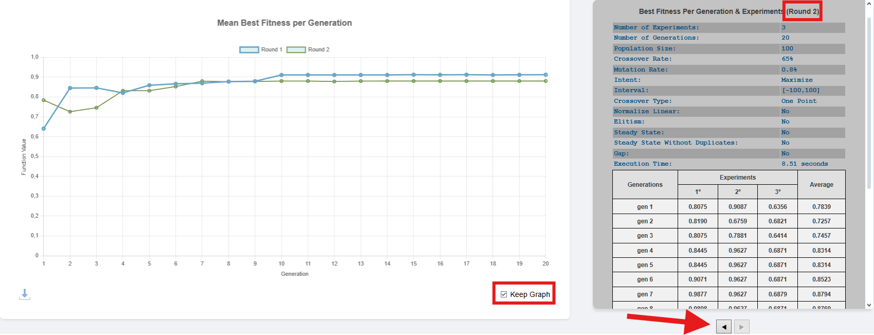
As shown above:
The checkbox Keep Graph (bottom right) allows retaining previous results when running a new round.
The left/right arrow buttons (below the result table) let the user navigate through the stored rounds, displaying the parameters and detailed table for each execution.
For instance, in the example above: - Round 1 and Round 2 are both plotted on the graph. - The table currently displayed refers to Round 2, as indicated at the top right of the table section.
Important
If the Keep Graph checkbox is unchecked, all previous results will be erased when a new round is executed. Therefore, if the user wants to keep a cumulative visual history of all runs, they must keep this checkbox selected before pressing Run.