Box Plot#
The Box Plot view provides a detailed statistical breakdown of the best individual values found across all experiments for each generation.
Overview#
This chart complements the “Average of Best Fitness Per Generation” view by adding descriptive statistical insights for each generation. Instead of a single average value, the box plot displays the distribution of the best individuals’ fitness values across all experiments in a given generation.
Box Plot Elements#
For each generation, the following statistical components are visualized:
Minimum (min): The lowest fitness value obtained among the best individuals of all experiments.
First Quartile (Q1 - 25% quantile): The value below which 25% of the best individuals lie.
Median (Q2): The middle fitness value among all best individuals — half are better, and half are worse.
Mean: The arithmetic average of all best individual values in that generation.
Third Quartile (Q3 - 75% quantile): The value below which 75% of the best individuals lie.
Maximum (max): The highest fitness value obtained among the best individuals.
Interpretation Example#
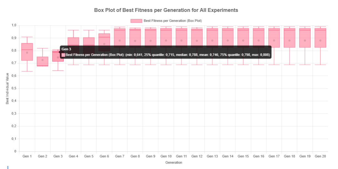
As seen in the image, in Generation 3, the box plot reveals the following:
min: 0.641
Q1 (25% quantile): 0.715
median (Q2): 0.788
mean: 0.746
Q3 (75% quantile): 0.798
max: 0.808
This indicates that while some individuals achieved high fitness scores, there’s also a noticeable spread, suggesting variability in convergence during this generation.
By observing how these statistics evolve from generation to generation, users can diagnose convergence behavior, outliers, and stability of the algorithm’s performance over time.
Note
The box plot is particularly useful for comparing variability between generations and identifying trends such as premature convergence, stagnation, or healthy diversity throughout the evolutionary process.